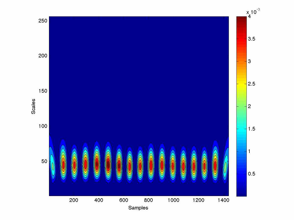
Another step in the evolution of human motion assessment has occurred from the team at Griffith University. The recent publication by Rowlands, Lee, James, “Visualization of wearable sensor data during swimming for performance analysis” in Sports Technology (DOI:10.1080/19346182.2013.867965) explains methods of visually depicting gyroscope data using novel 2D overlay techniques of the repetitive data. These methods included overlay plots, ribbon plots, phase-space portraits and wavelet scalograms. All the methods used clearly highlight the differences in the action of the elite and sub-elite swimmer involved in the case study. The consistency of the elite swimmer’s body-roll compared to the sub-elite swimmer appears to be most apparent in the state phase plot. This is an exciting new avenue in our research direction and will continue to be a focus of our research. The article can be found here: http://www.tandfonline.com/eprint/JzWQC3gznYpe2xtIgXIw/full
Visualization Of Wearable Sensor Data
Leave a Comment on Visualization Of Wearable Sensor Data